Getting a decent family photo with small children is a task and a half!
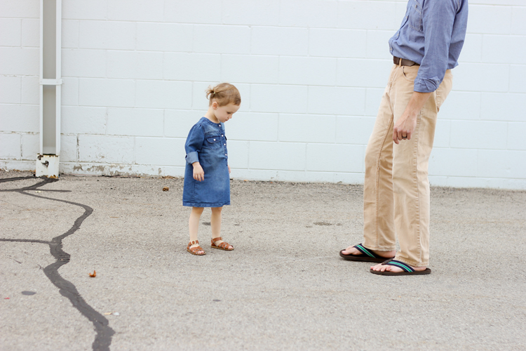
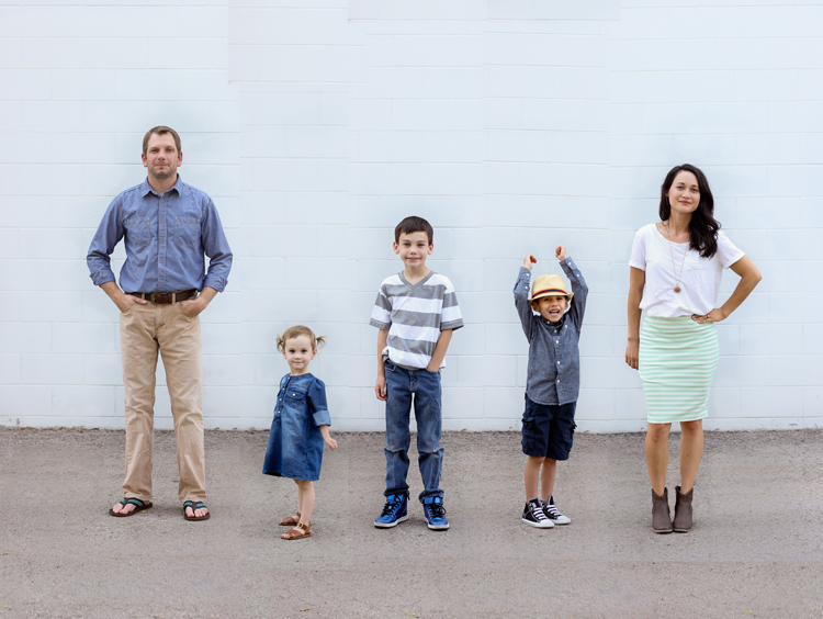
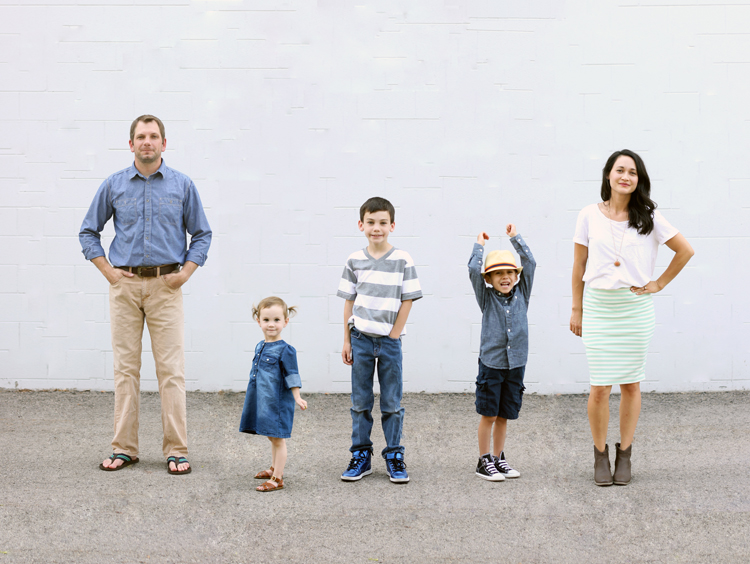 When organizing our family photo shoot for our most recent family photo (see THIS post), I decided to cut through all the headache, and take each person’s pictures one at a time; then merge them together during editing.
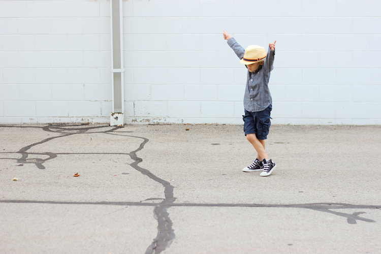 Sounds simple enough right? Weeeellll…yes and no. I learned quite a few things along the way, made about 20 different merged photo versions, and have compiled a list of helpful tips to pass onto you.
PHOTO TAKING
Background – For a merged family photo like this, a plain background like an empty wall is ideal. If you have a white professional backdrop, that’s even better.
Tri-pod – For really consistent, precise pictures, use a tri-pod. Set it up and don’t move it. I actually forgot mine during the melee of leaving the house, and ended up paying in post editing time because the photos weren’t quite as consistent as I would have liked. Luckily, I have enough editing software that I was able to manage fine. If you don’t though, using a tri-pod is crucial.
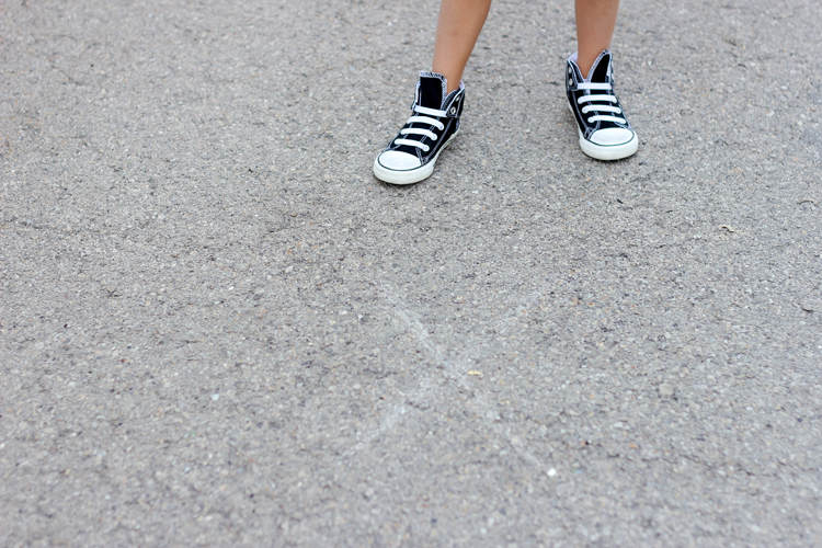 X marks the spot – Mark a subtle X on the ground so your subjects know where to stand each time. My littler two struggled with this somewhat, but I just made sure to snap quick when they were on the X. Even then, it was far easier to snap at the split second they were ready then try to get everyone to look at me at the same time like I would have to with a traditional picture.
Before I go into how to do this, there are few things you should consider.
1. What are you using the photo for? If you are making Christmas cards that will be printed at a small size, then you can use any of the methods I describe below. The same goes for a digital format, if you are just sharing the photo online. If you need to print a larger photo, larger than 8×10 inches, then you need to be really careful about what photo editing software you use to make the merge, as some editors will compress and pixelate your image.
2. What kind of camera did you use? If you didn’t use a DSLR, consider sticking with creating a small image.
3. How consistent are your photos? If you used a professional white backdrop and a tripod, it makes the merging and editing phase significantly easier for any photo editor. If you use a plain, but not completely white background and no tripod, like I did, you have to work a little harder and you may need to use more sophisticated photo editors. (I ended up using more than one to create my merged photo).
*Please note: I only explain software tools and techniques and how I use them, briefly. If you are unfamiliar with any of the tools I use, google the tool and how to use it. I can almost guarantee that your google search will be replete with tutorials and video tutorials on how to use almost any photo editing tool you need.
PICASA (free photo software)
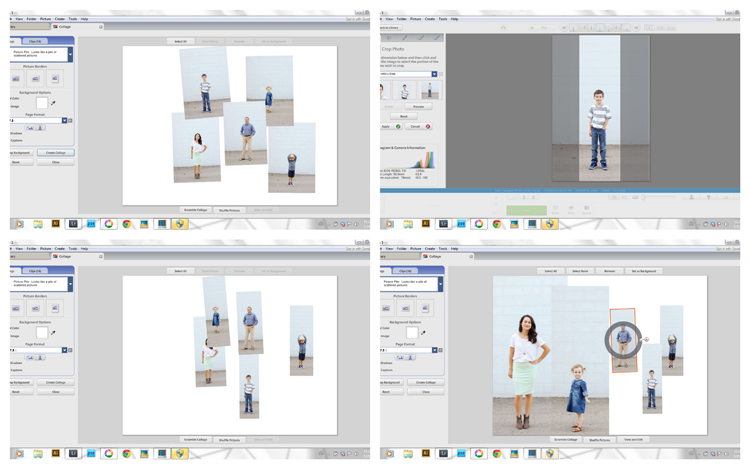 I am unfamiliar with Picmonkey but I imagine you could create a merged photo with that photo editor as well, or any other free photo editor that allows you to freely collage photos. Picasa is Google’s free photo editor. Unless you tell it not to, it will grab any photos on your computer and file it away into it’s archives. From there, you can create collages anyway you like.
1. Create a new canvas size to the size you want. (You can make a custom size if you scroll to the end of the list.)
2. Choose the Picture Pile option in the collage settings.
3. Uncheck the shadows box.
4. Then add the pictures and line them up how you want them. You may need to crop the pictures before adding them to the collage so that your subjects won’t be spaced so far apart.
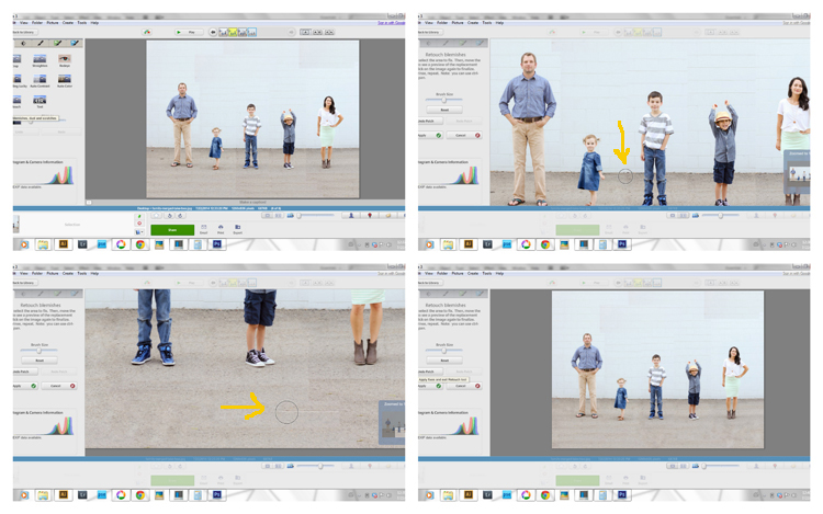 5. Once you have your photos merged and your collage is created. Open the healing brush and heal any seams in the pictures.
For my background, I had some painted brick. It was no where near matching up between the merged photos, so I healed bits and pieces of it until it all looked like a cool texture wall. This process is quite tedious, but worth the time.
NOTE: I cannot guarantee the print quality of a merged photo created in Picasa. It’s worth testing out, but I would bet that you will likely only be able to use the image online or at a smaller size.
PHOTOSHOP ELEMENTS
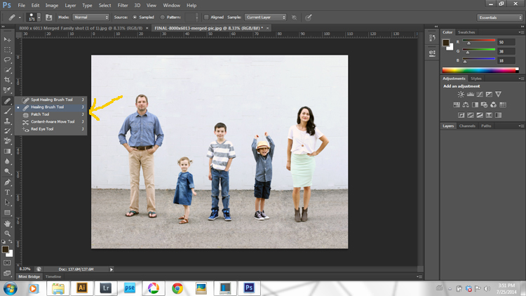 Create a collage in a similar fashion to the Picasa steps. Use the healing brush to clean up the seams in the same way. PSE should do a better job of creating a merged image you can print at a larger size, but I haven’t specifically print tested PSE for that.
ILLUSTRATOR
Because I didn’t use a tripod or a white background, my photos were not as consistent and needed some extra work. I found Illustrator to be really helpful.
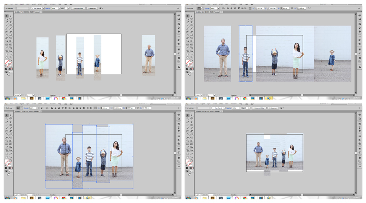 To crop the photos inside Illustrator (which helps maintain better picture quality), create a rectangular shape on top of the photo. Place it where you want the image cropped, then right click and press “create clipping mask.” You can also take a short cut and press Crtl 7. Voila! Cropped image.
Once I got my photos lined up how I liked, I selected all of them, and then re-sized them to fit the canvas, while pressing down the shift key (so that the photo ratios would stay the same and not get distorted). This is why it’s important to crop photos inside illustrator. That way you can re-size the pictures as needed without running into pixelated or too small images.
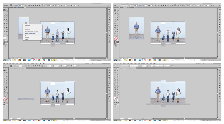 Because my photos weren’t consistent, I ended up with gaps at the top and bottom. To fill them up:
1. I copied and pasted one of the pictures to the side.
2. I right clicked and released the clipping mask. I resized the rectangle so it would grab only some of the ground or the wall. I then pressed Crtl 7 and created a clipping mask again of just those ground/wall details.
3. I fit those pieces onto the canvas like a puzzle until all the gaps were filled. It creates a patch work kind of look, but it can easily be smoothed out in PSE, Photoshop or Lightroom. When you save the image, save the Illustrator file, and then save it for web as a jpeg. When you do that, it will cut off anything that isn’t inside the canvas, so don’t worry about any patch work pieces that run over the edges.
LIGHTROOM
You can’t create a collage in Lightroom, but you can open an existing one and clean it up really well.
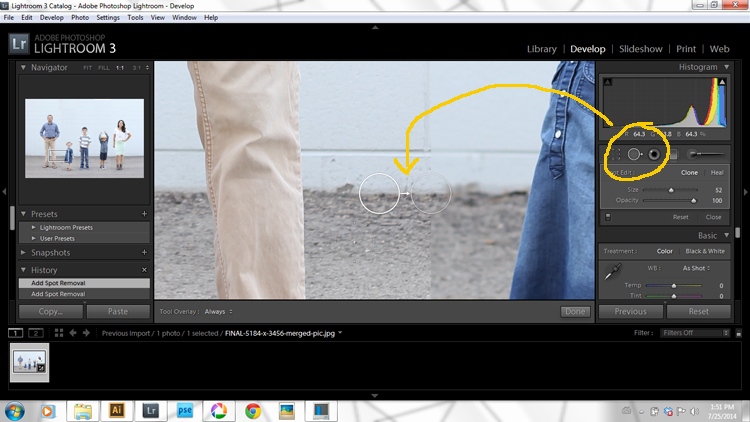 The clone/healing tool works great for cleaning up seams. I used it to turn the mismatched brick on the wall into a textured wall as well.
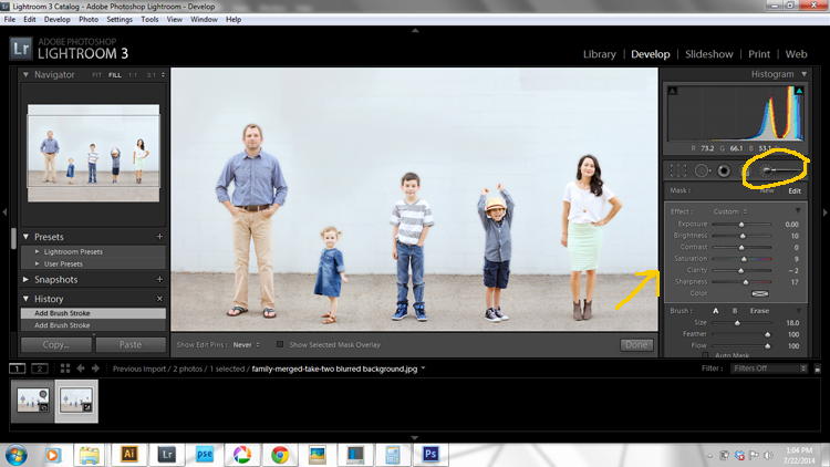 I also used the adjustment brush tool. I decreased the clarity and increased the exposure just a little bit and then used the brush tool to soften the wall and the ground.
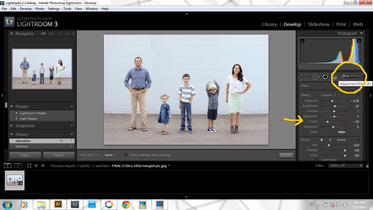 I also used the brush tool to sharpen up each subject. Instead of decreasing the clarity, I increased it and also increased the sharpness. **Just be sure to close out the old brush before changing any brush settings for a new task.
Even though Lightroom is a fantastic and precise photo editor, it can sometimes compress the picture size for printing. I will talk about that in a minute.
PHOTOSHOP
 This program is the best for maintaining picture size and quality, and is actually the easiest to use for editing a merged photo. I used illustrator to do the actual merging, but then cleaned up the photo using the healing brush in Photoshop. It was fast, easy and the best for printing in large scale.
PRINTING YOUR MERGED PHOTO
If you are using your image for the web, or printing at a small size, you should be good to go with any merging method.
If you want to print on a large scale, I highly recommend creating the merged photo in illustrator and then cleaning it up in Photoshop.
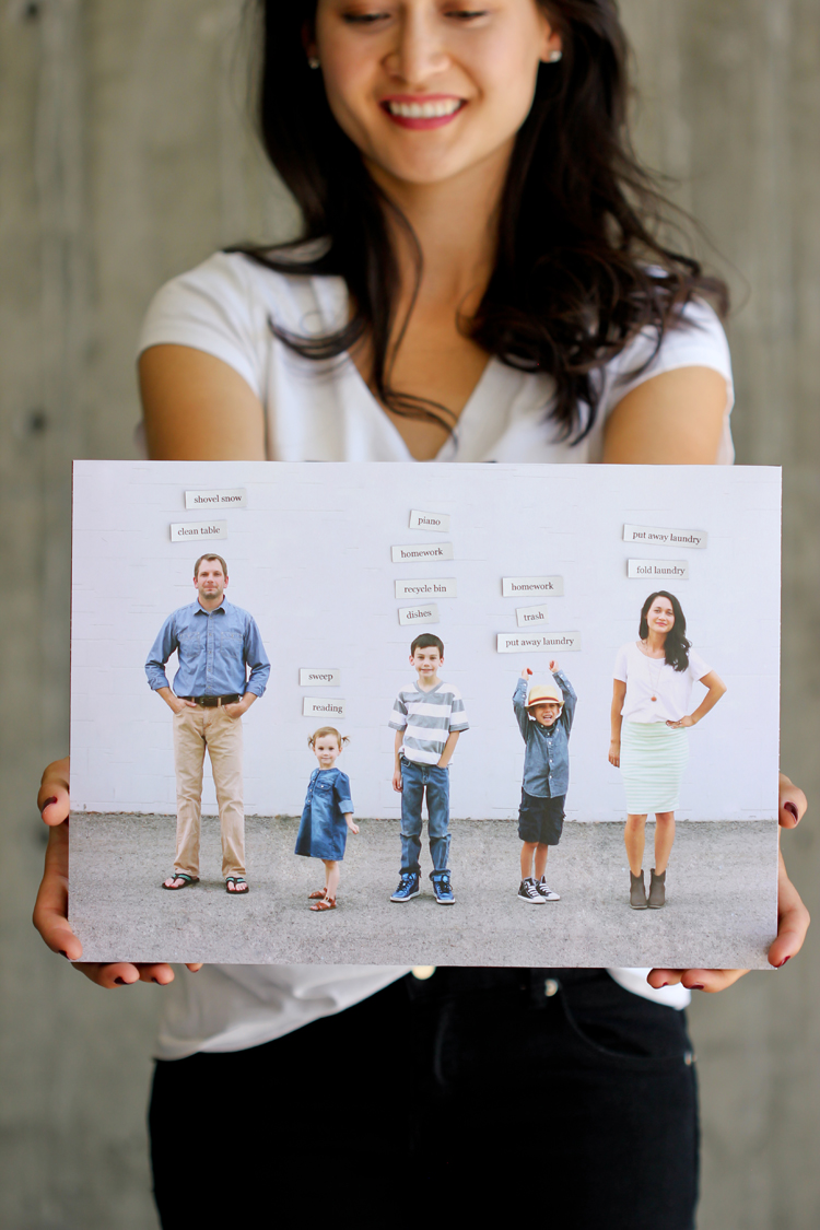 (photo above is chore chart DIY from THIS post)
Let’s talk dpi…
Your print shop will likely request 300 dpi as the standard image quality for your photos. I highly recommend reading THIS article about the myth of the dpi. It is quite lengthy but worth getting through if you are interested in enlarging your photos.
You see, most DSLR’s shoot photos at 72 dpi. That is significantly lower than 300, but the file of the image captured is so large, that it will still print crisply at a large size even at 72 dpi. For example, you can take a photo straight out of your camera and print an engineer print at 2 ft. by 3 ft. with crisp clarity at 72 dpi.
If you use Lightroom, it will increase the dpi to about 600. This sounds all fine and good, but it doesn’t necessarily make the picture quality better at a larger size. Each original dot simply gets a few more cloned dots around itself, thus expanding the dpi, but in some ways compressing the image.
I admit that am NOT an expert on Lightroom. I am simply relating the issues I had in using Lightroom for a merged photo. I am not sure why, but using Lightroom made it very difficult to print a crisp image at anything larger than 8×10. It has so many bells and whistles that I am still figuring out though. I am hopeful there is a setting that will fix the compression issues I ran into.
I ended up creating about 20 different merged images using different methods: direct selection tools, Gaussian blurs, all kinds of different things. I ended up printing five of them and finally found one method that worked the best for creating a clean image that can be printed on a large scale.
What finally worked for me, was to:
– Merge the photos in Illustrator. I created a canvas MUCH larger (but the same ratio of height to width) than I needed.
– Edit and heal the background in Photoshop with the healing brush. Save the image at the highest quality possible.
– Print your merged photo. I took the super large image to a print shop and had them resize and crop the image down to the size I needed to print. You can resize the image yourself. Just be sure to double check that it is the correct size using your rulers in Photoshop.
That’s it!
Of course this is just one way to merge a photo. Depending on what kind of background you have to work with, you can explore the photo merge features in PSe and Photoshop as well. This basic rule applies to any method though: The more work you put into making the original pictures consistent and simple, the less work you have to do in post production.
If you have any questions, I would be happy to answer them in the comments section!
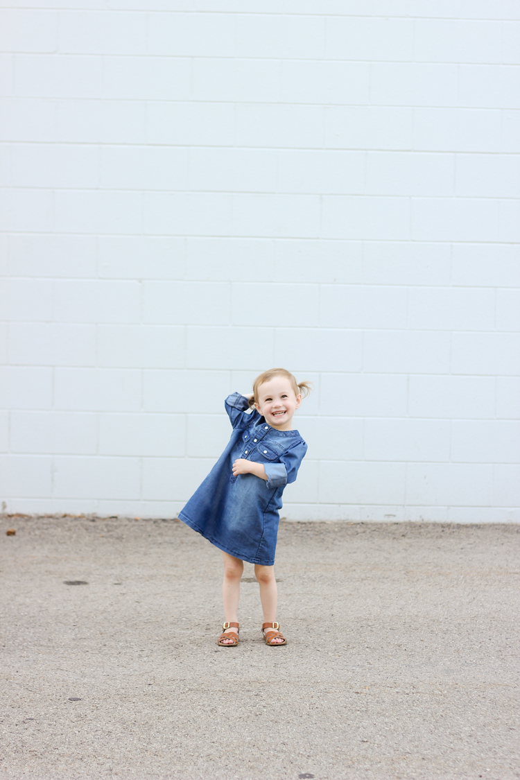
(This is one of the merged versions I created using a Gaussian blur. Not my favorite version, but still a nice one.)


A tip for those that might be attempting this; If your background is large enough put 5 “x”s on the ground. Photograph each family member on their x. If you’re camera was on a tri-pod and you don’t change the settings it will be VERY ease to add in each family member and your background will stay clean etc. You could even do this with an unclean background (trees etc) as long as you use a tri-pod and never move it.
Great tip! Thanks Kelly! Definitely if you have a large enough background and have photoshope pse you can use the photo merge feature. Thanks for mentioning it.
Fabulous. Can’t wait to try this out after I spent a fair amount of money on a family photo shoot a month ago that didn’t give us ONE good photo together. Ugh. This is awesome. I also LOVE ipiccy and it’s totally worth checking out. It’s online and free and I think you could do all of this on it. Thanks for the great idea, Delia!
Ooh cool! I have never heard of ipiccy. I will have to look into it. Thanks Cheri!
Delia this is brilliant! Thanks for such a great detailed explanation. I’m tempted to try this. I’m still getting used to my camera shooting in manual, do you mind telling us what settings you used for these shots? 🙂
Such a great picture! Will have to try this some time.
I totally didn’t guess that you had merged the photos until you mentioned it…. I just thought your family was awesome at posing for photos! Thank you for the tips! I wouldn’t have even considered using Illustrator for anything concerning photos.
I wish we were good at posing! haha… Thanks Charity. 😉